LeadCon 2020
What I worked on:
Art Direction | Design | Illustration | Motion Design | Brand
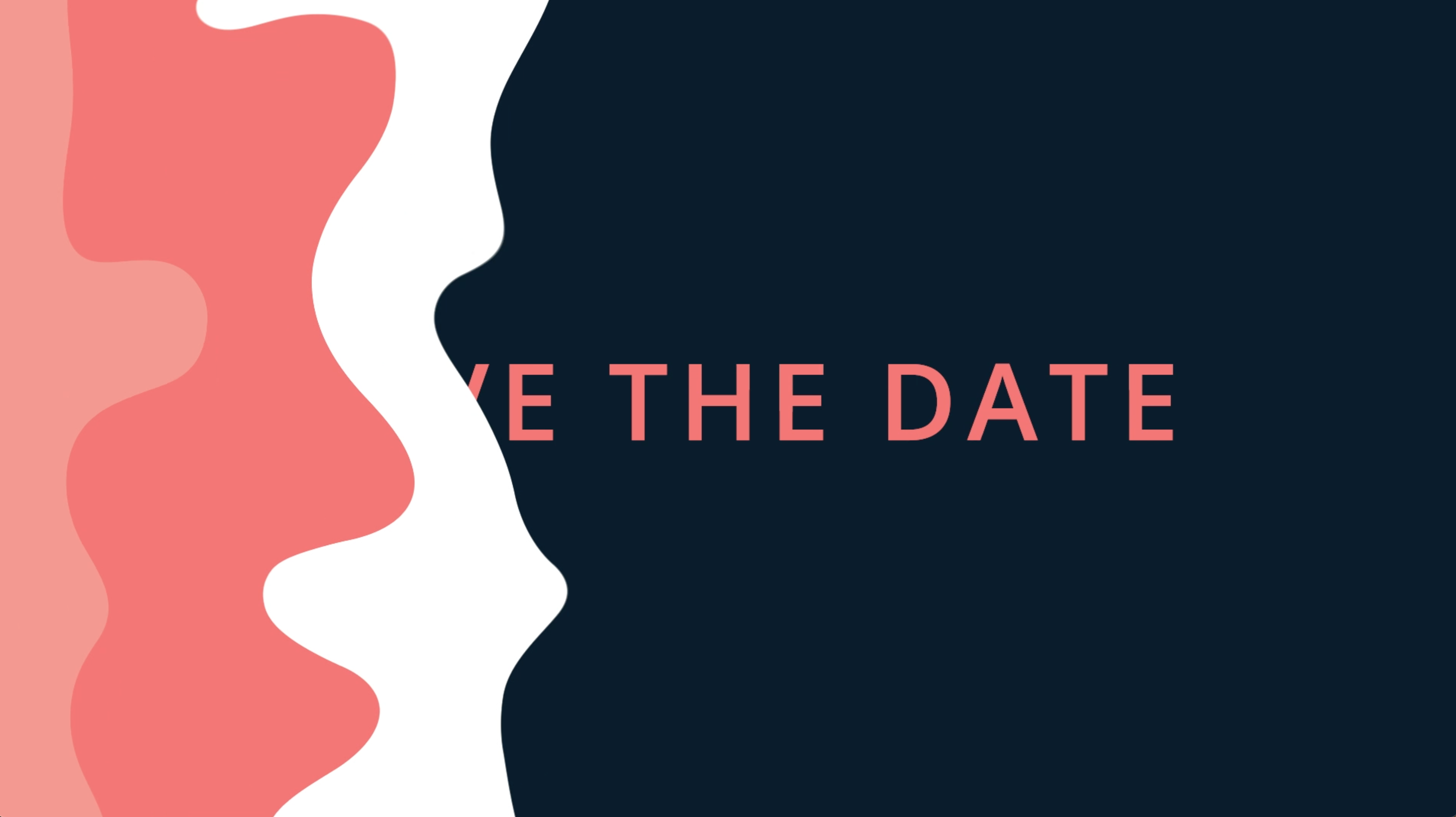
An event celebrating making waves as a lead.
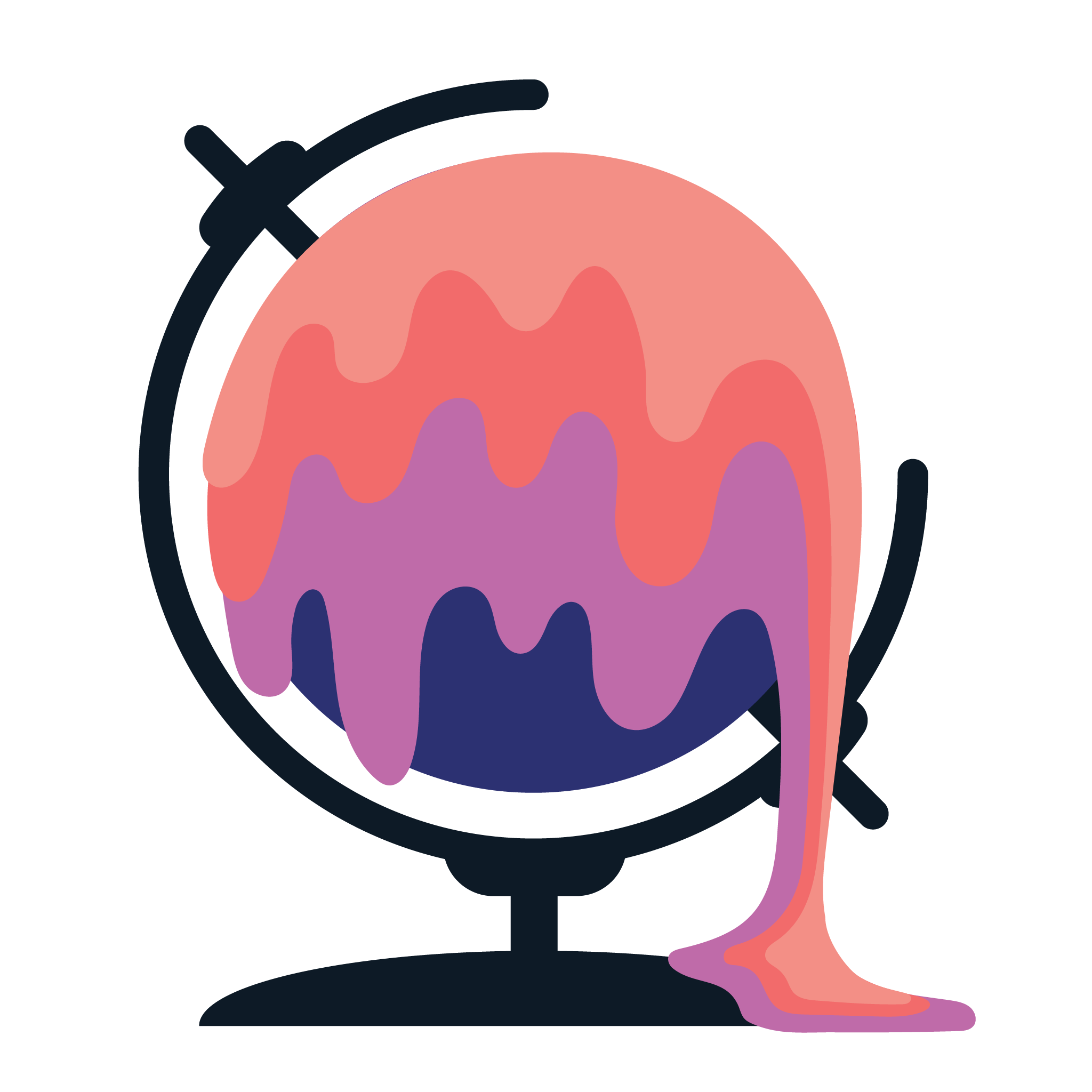
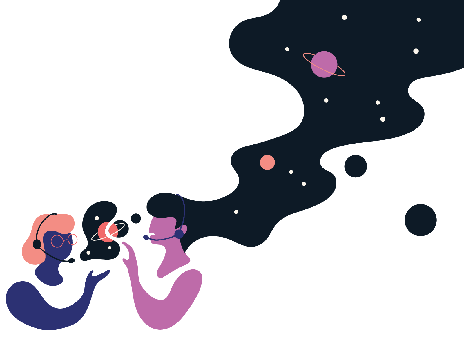
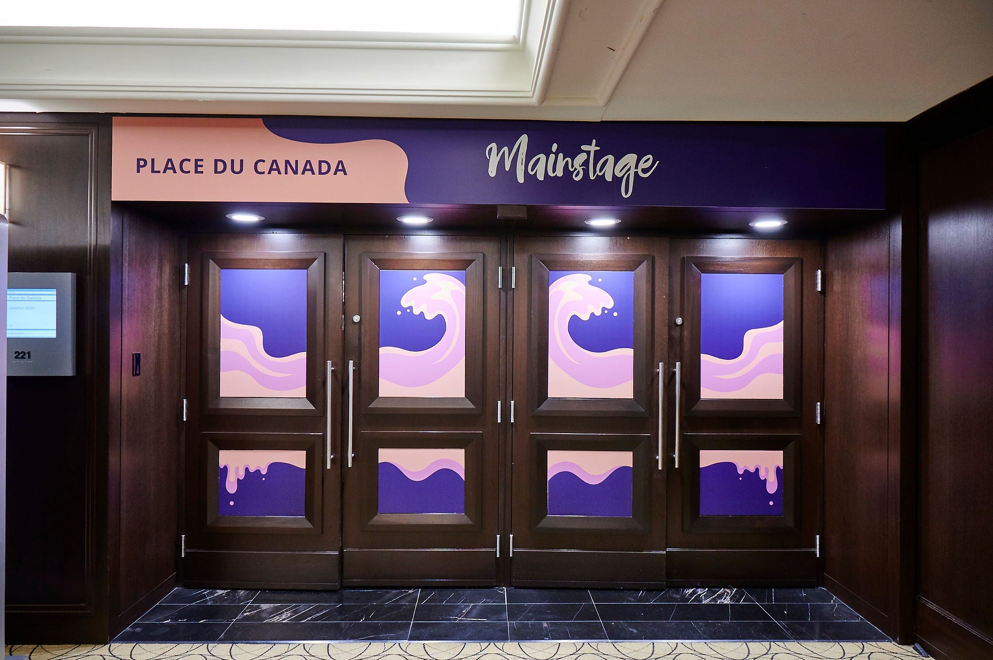
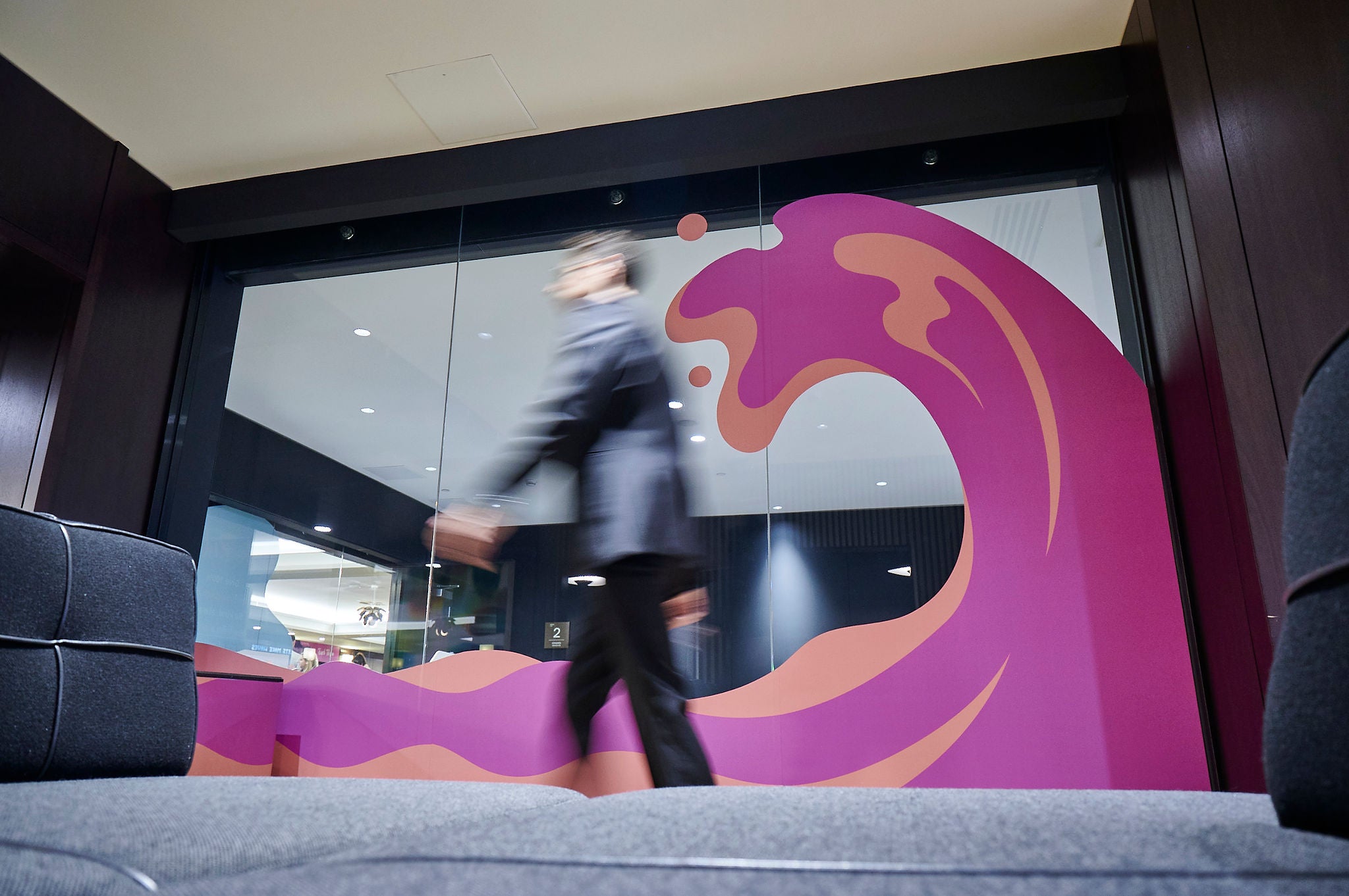
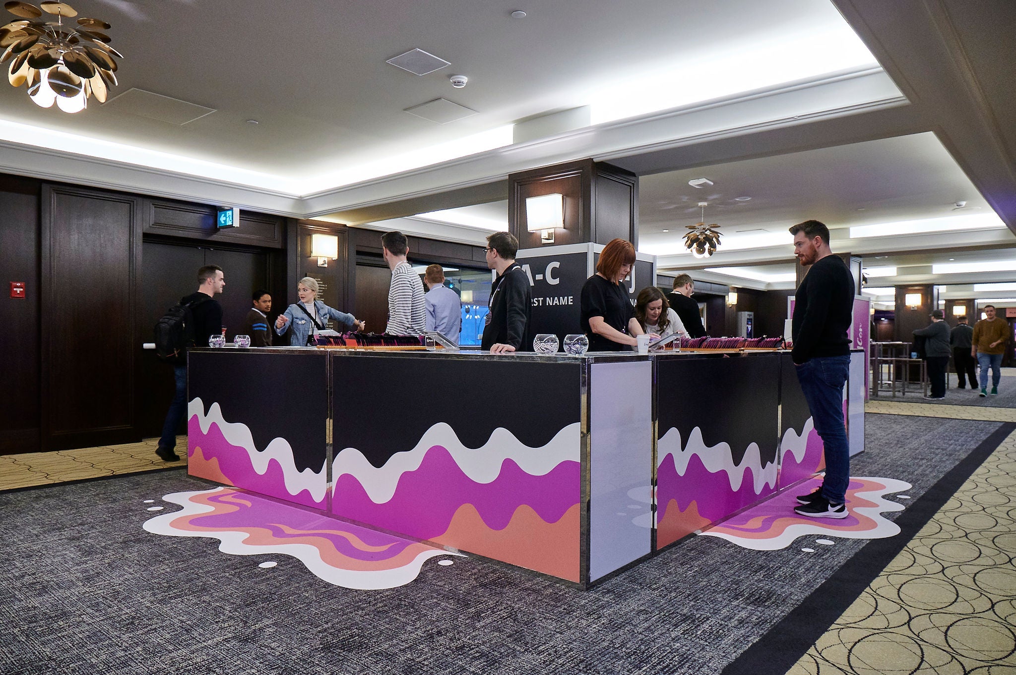
LeadCon 2020 marked a pivotal moment in my career as I embarked on the challenge of developing an event brand that diverged from our company's established guidelines. Guided by the theme of 'making impact as a lead,' I harnessed the essence of breaking free from traditional structures and filled space, by exploring more fluid shapes. The concept of 'impact' organically transformed into captivating waves and dynamic liquid motion, captivatingly occupying and transforming the event environments where our leads converged.
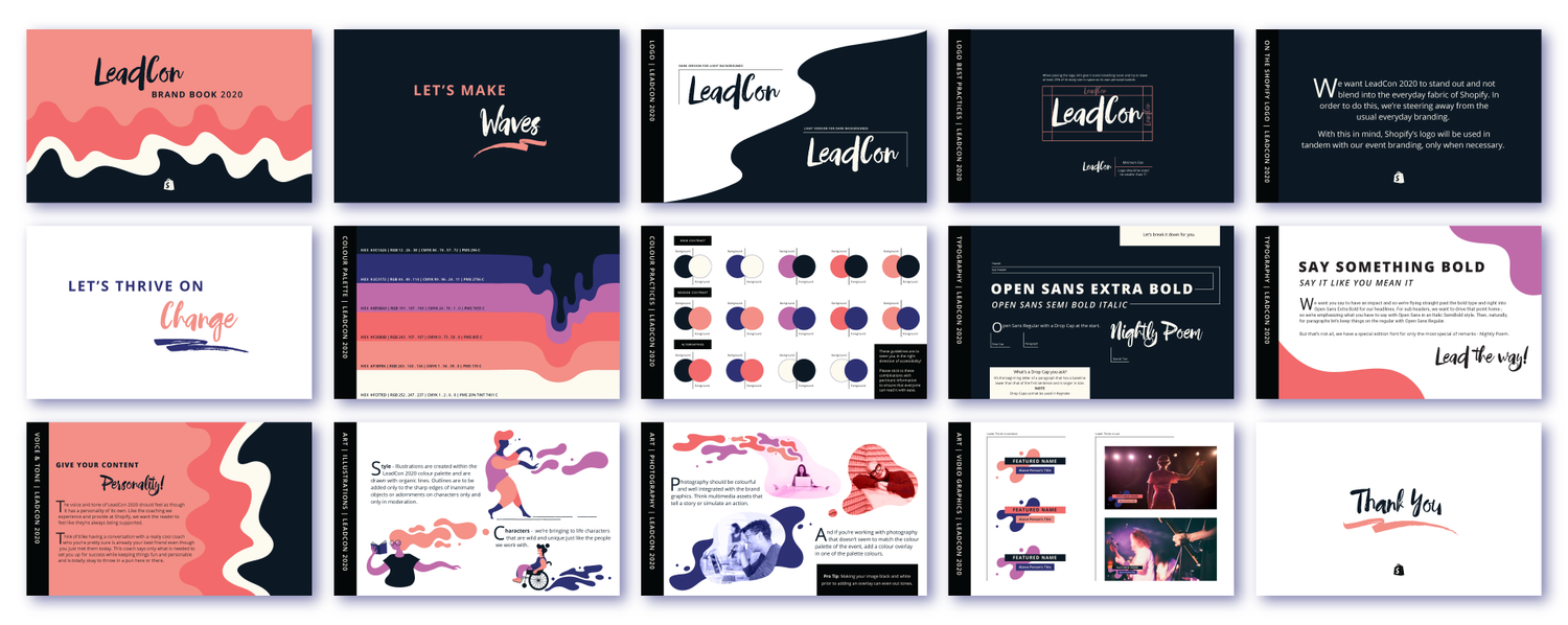
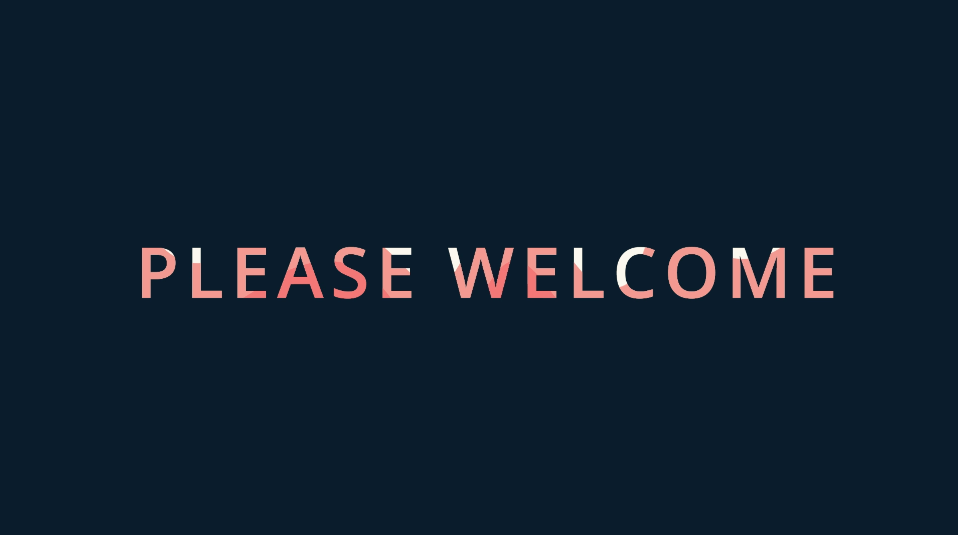
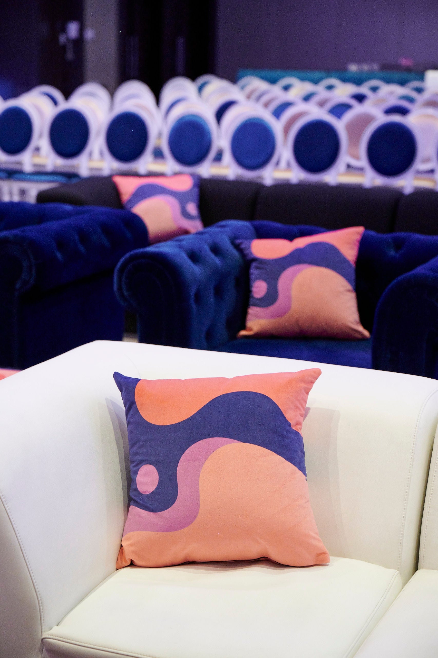
To amplify creativity and fun at LeadCon 2020, I turned our liquid into colour - giving it the illusion of paint. And to compliment this, I created a more organic event logo using a brushstroke logotype "Nightly Poem" as though painted by a brush dipped in the liquid of our event.
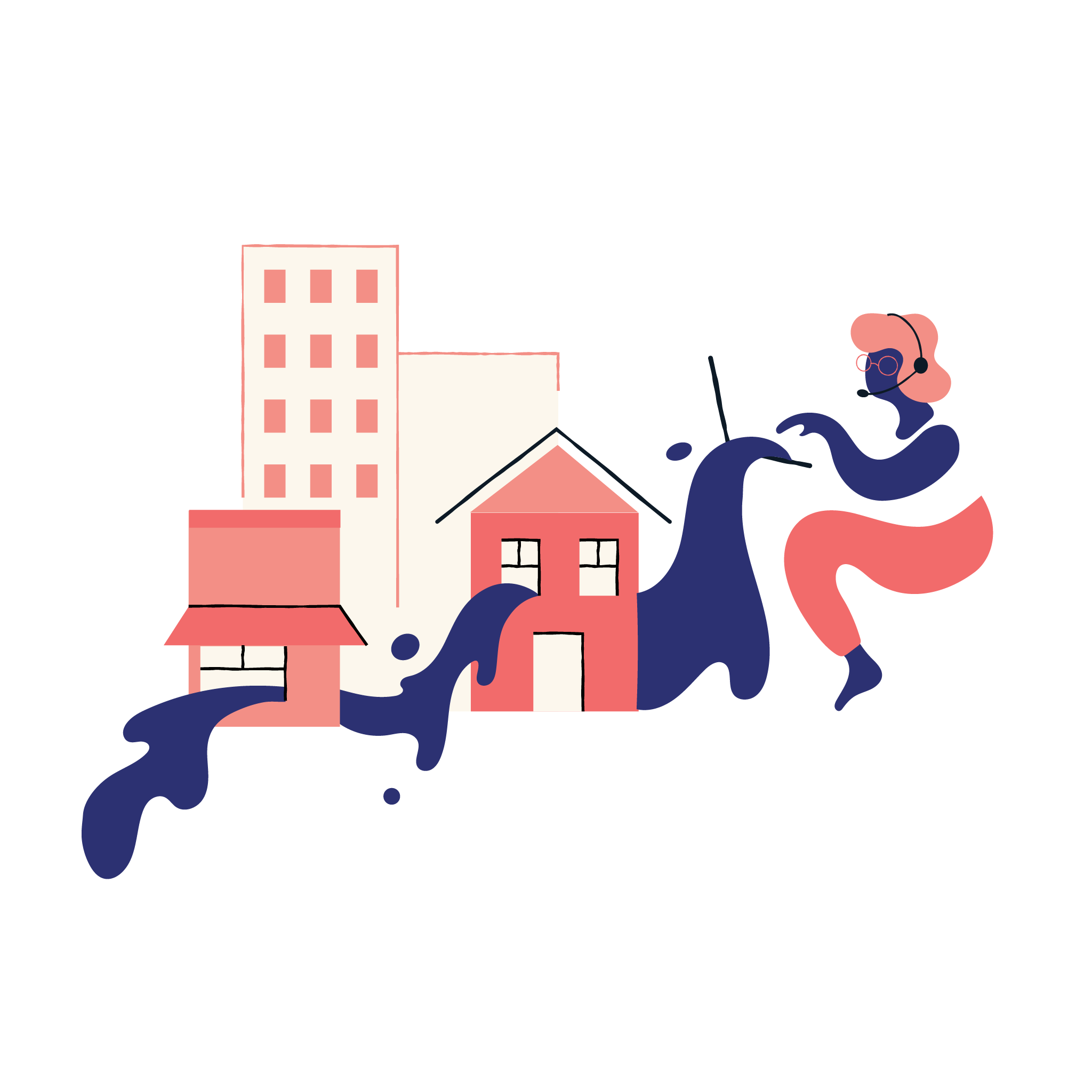
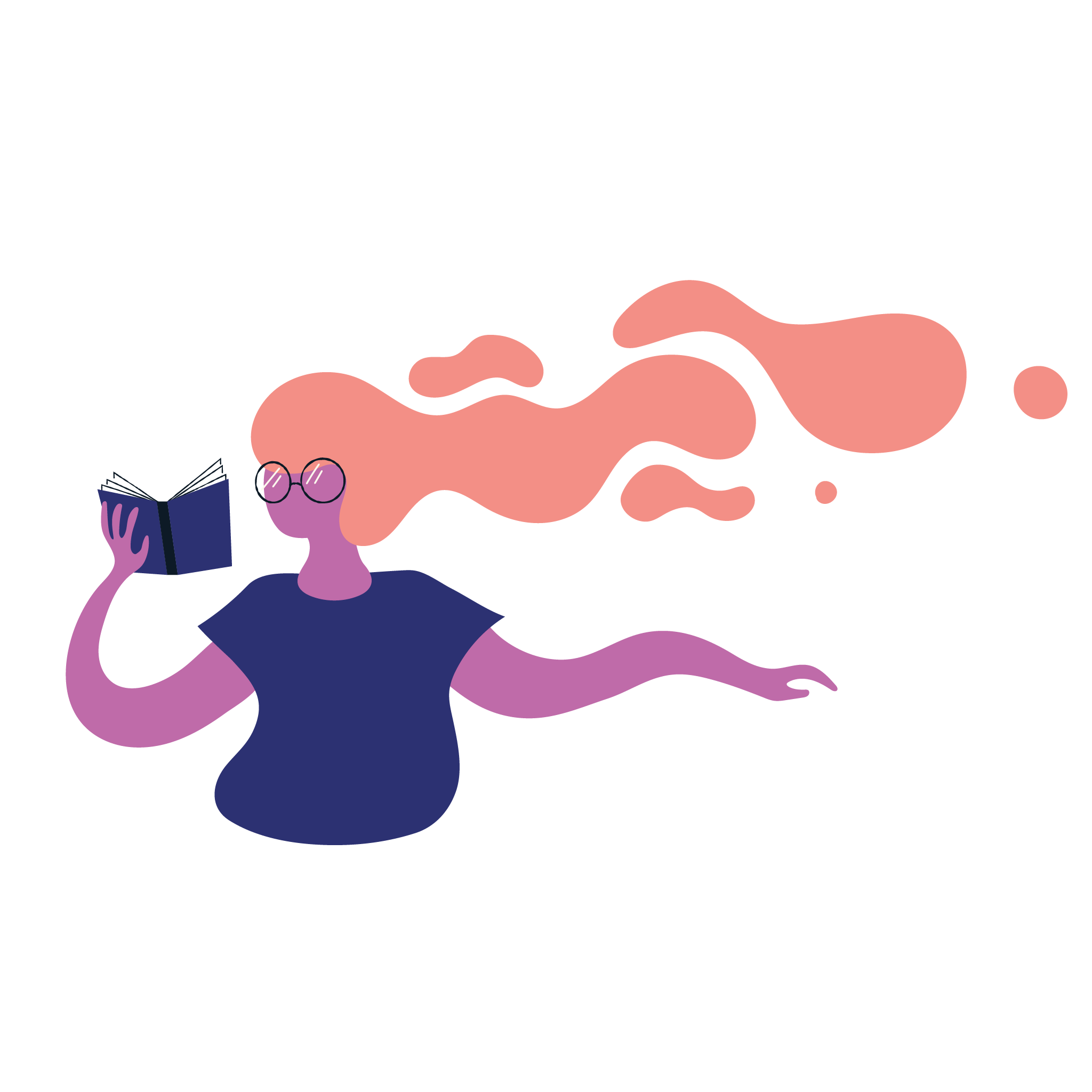
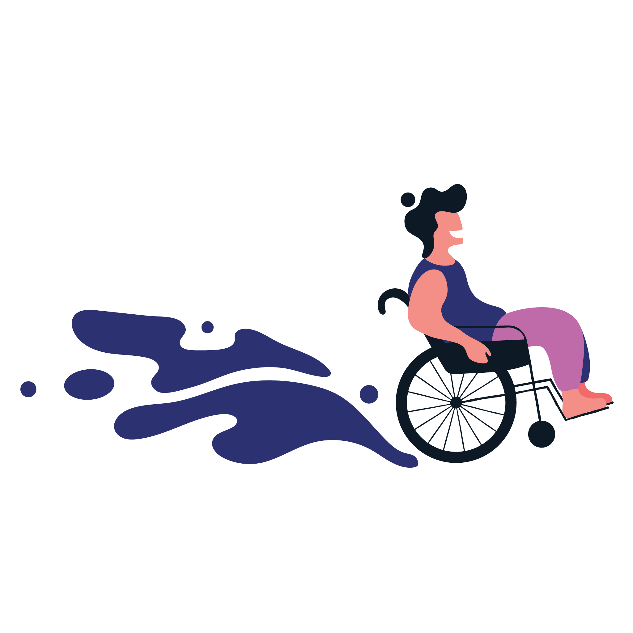
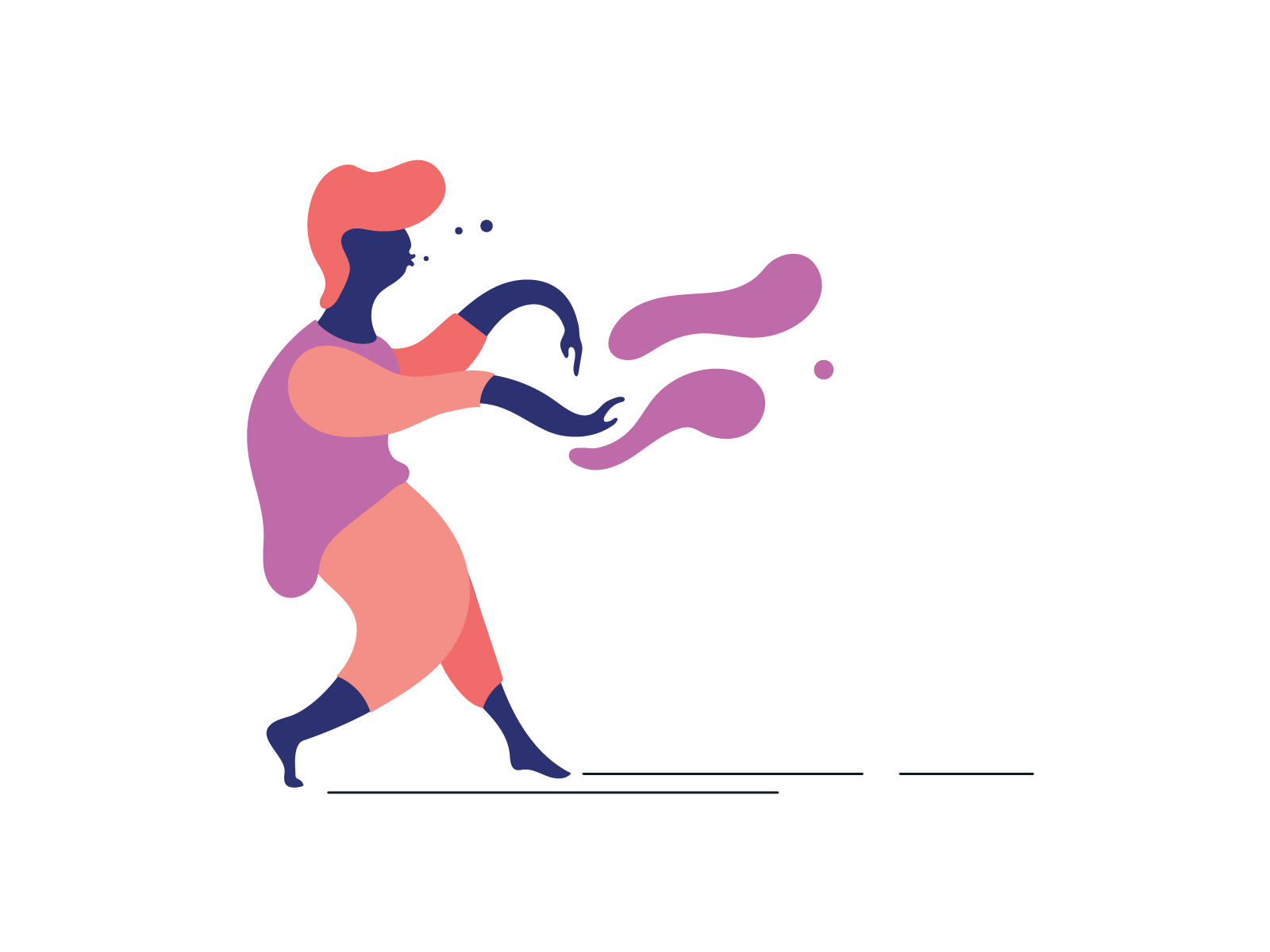
As the metaphor of liquid impact grew, I was able to incorporate it into instances where leads may not realize they could make an impact. The obvious scenarios of mentoring and carrying out their day to day work existed but I also wanted to show that you could make an impact by gathering knowledge or by just being there, creating your own path of impact from nothing.
This was the first event during my career at Shopify where I was able to incorporate a bit more motion into our brand. Previous to LeadCon 2020, it was common for still imagery to be used as an intro screen for speakers. Intro sequences were combined with our speaker's chosen walk on music to create hype for the upcoming talk. Not only did this get our crowd excited for what was to come but it literally set the stage for a more energetic delivery from our speakers.
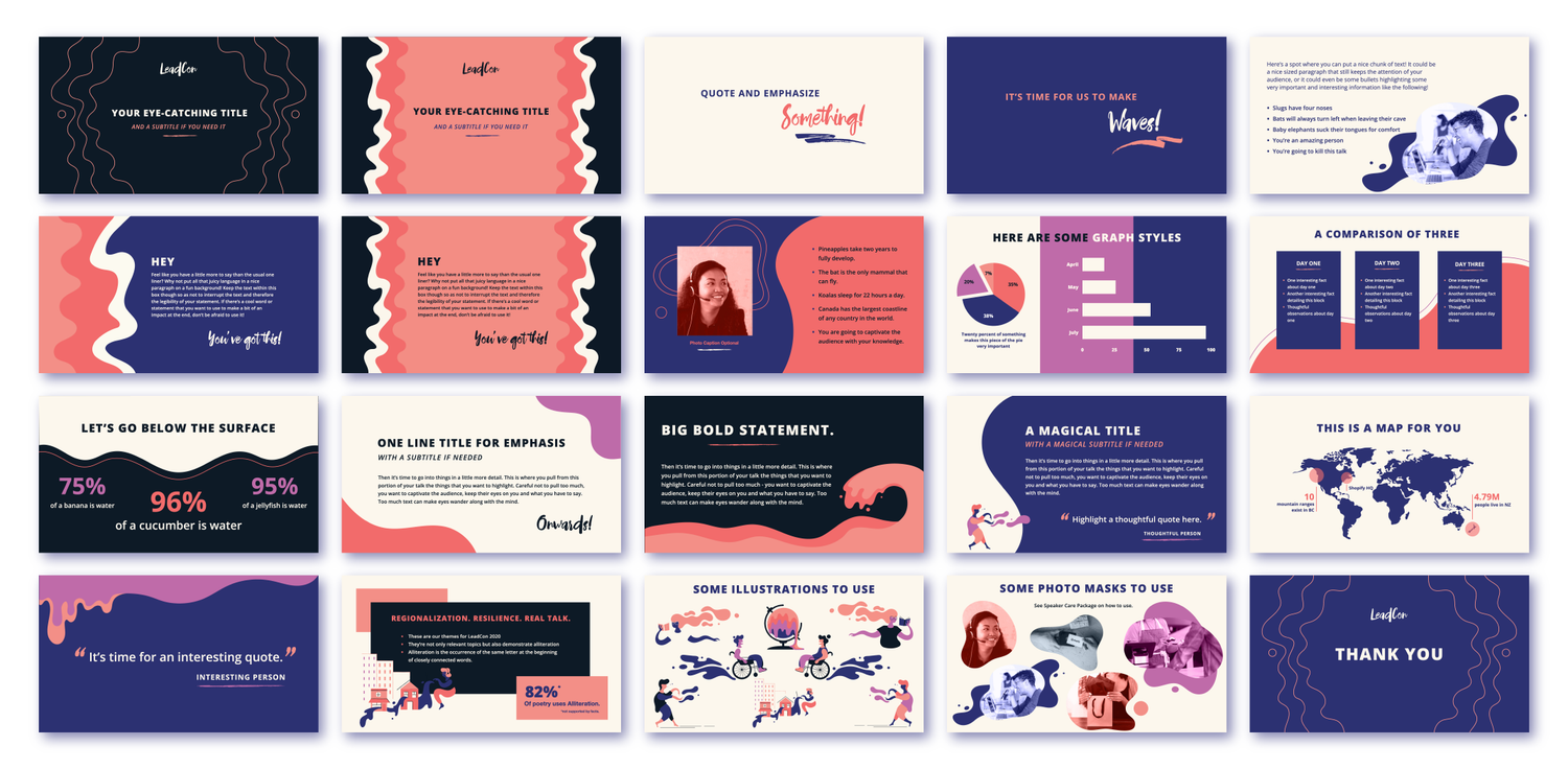
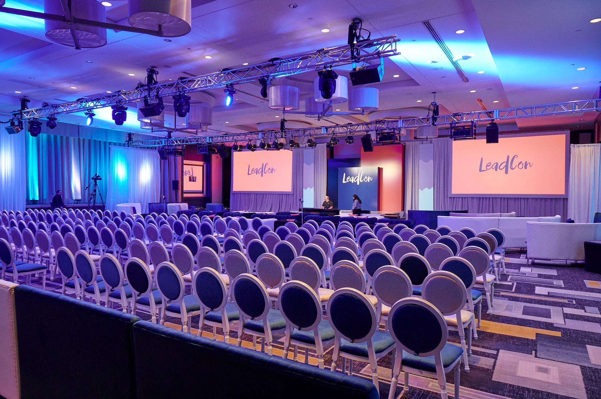
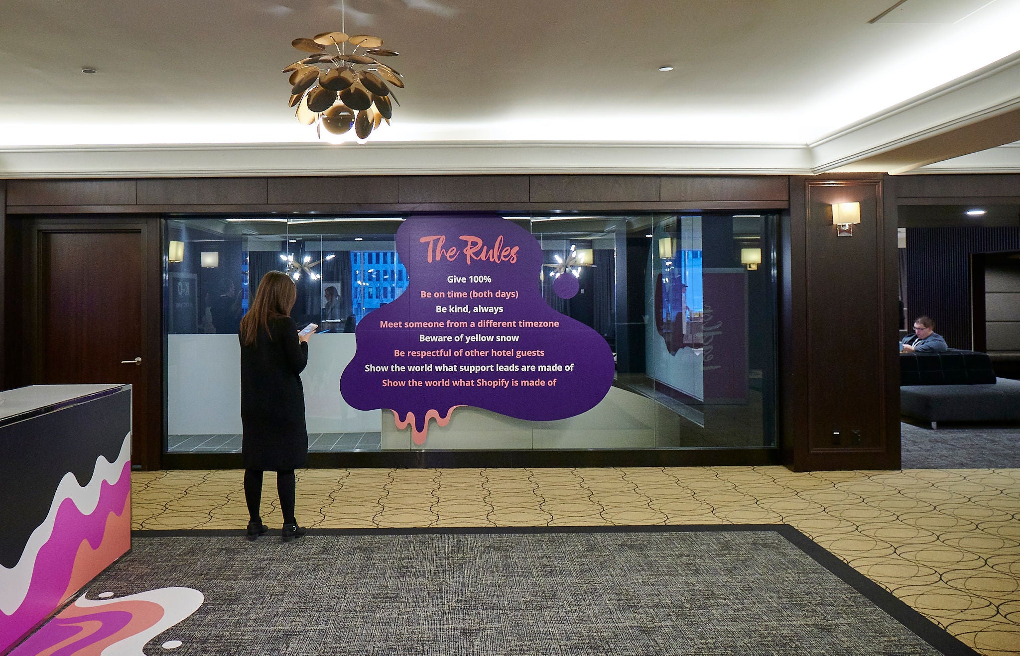
When designing for an in person event, it is important to think about not only the visuals that appear on the screens during the main show but also how the work in tandem with the visuals around the venue. For LeadCon 2020, we wanted to put our creative stamp on every part of the venue.
Swag was minimal at this event as we wanted to put more emphasis on the overall experience versus giving away physical items.
-
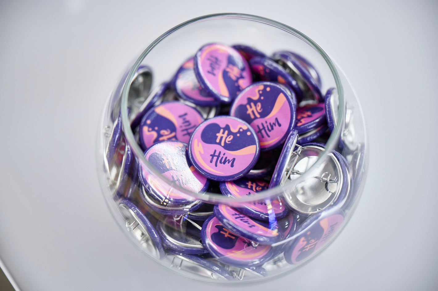
Pronoun Pins
This was the first event where we were able to introduce Pronoun Pins so that folks could identify their pronoun on the lanyards of their badge.
-
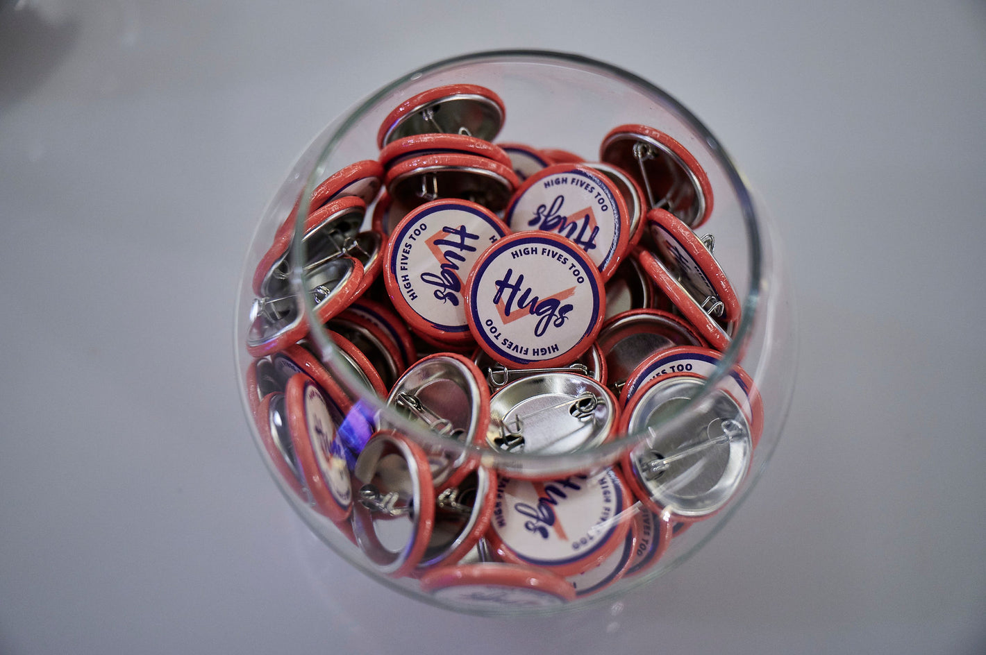
Hugs / No Hugs Pins
As we knew that there would be many hugs at our event, we wanted to give folks the opportunity to state their comfort level beforehand.
-
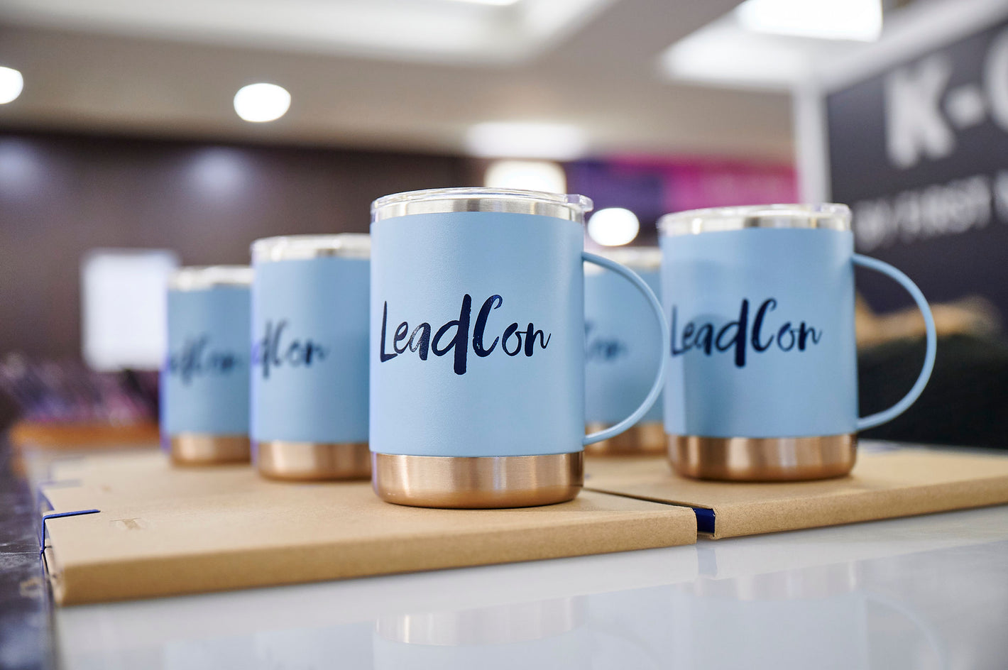
Branded Mugs
We worked with a sustainable merchandise company to source high quality mugs for our folks to use for coffee and drinks at the event.


